Introduction
Exclaimer is a SaaS platform that allows organisations to effectively manage their Microsoft 365 or Google Workspace email signatures.
The current user journey for a free trial is simply not working. It’s long, convoluted and as a result a huge number of users drop off without ever completing it. This is impacting sales and brand confidence.
You can also view this project in Figma.
Roles and responsibilities
I was the Lead Product Designer focussing on UX. There was a project manager and project owner. And as part of the design team, I also worked with 3 other designers who all had UI and front-end development experience.
Defining the problem
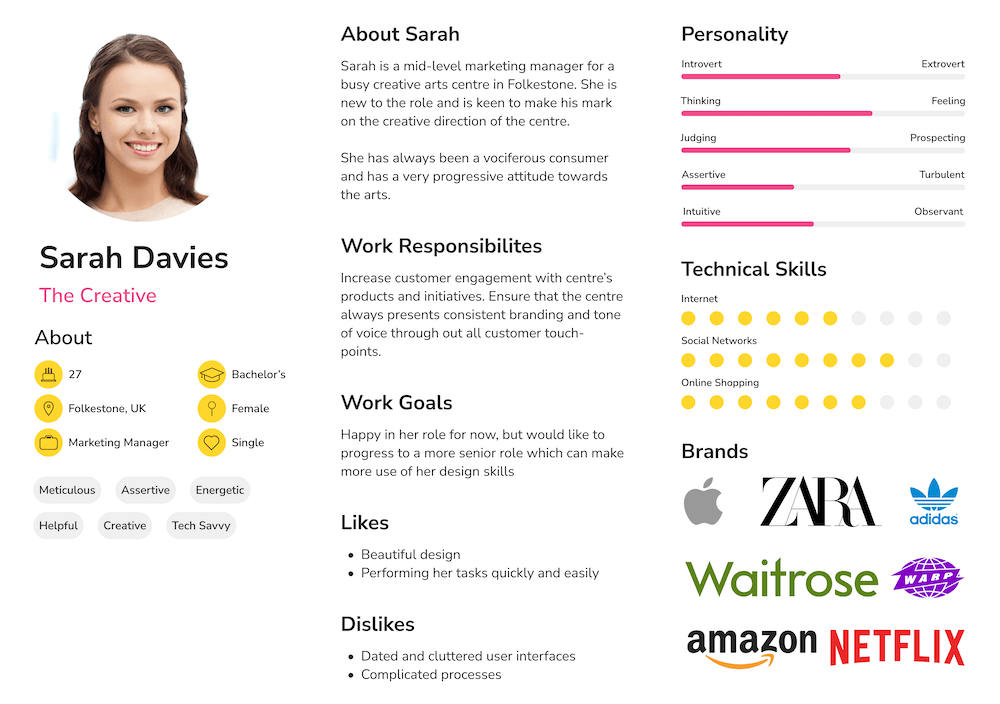
So the first step is to actually define the problem. So we selected one of our pre-defined personas and created a problem statement around it.
Sarah. A mid-level marketing manager.
I'm trying to
Use the free trial to see if Exclaimer is the right product for us.
So that
Our company has branded, consistent signatures.
But
I can't seem to easily create a signature to my liking that I can share with my colleagues.
Because
The interface is confusing and it isn't clear where I can actually design the signature.
Which makes me feel
Like this isn't the product for me, so I'll look elsewhere.
Current solution
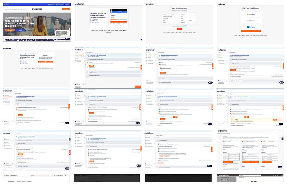
From the homepage of the Exclaimer website, users can click on the ‘Free Trial’ button. The primary aim of this journey is to allow a user to engage with the signature designer and see if it fulfils their requirements.
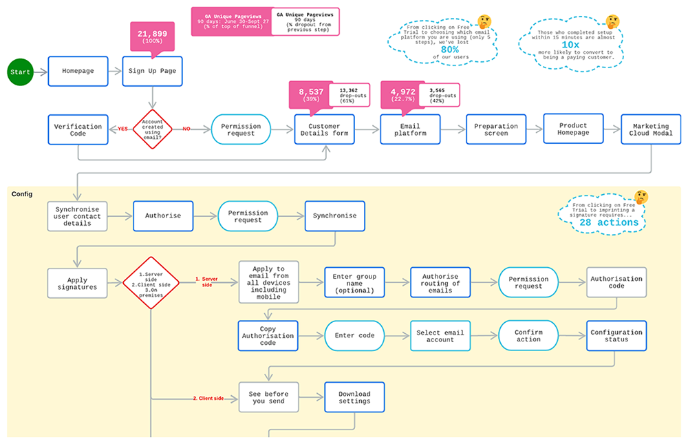
However, as soon as they start, they have to give us some details about themselves and their organisation. They then have to go through a relatively complex configuration process before they are finally presented with the product. And even then, it’s not entirely made clear where and how they get to design their signature.
Quantitative UX Research
Cross-referencing across a variety of data sources (Google Analytics, Salesforce) we can see that the biggest story here is that over 80% of users drop off very early. For those that persist, they then have to go through 32 individual actions before they are ready to create an email signature.
This as you can imagine, will result in a very low number actually succeeding. But we also understood that those who completed the setup within 15 minutes are almost 10 times as likely to convert to being a paying customer. So it’s obvious that by improving our completion rate for free trials, we will gain huge wins as a business.
Qualitative UX Research
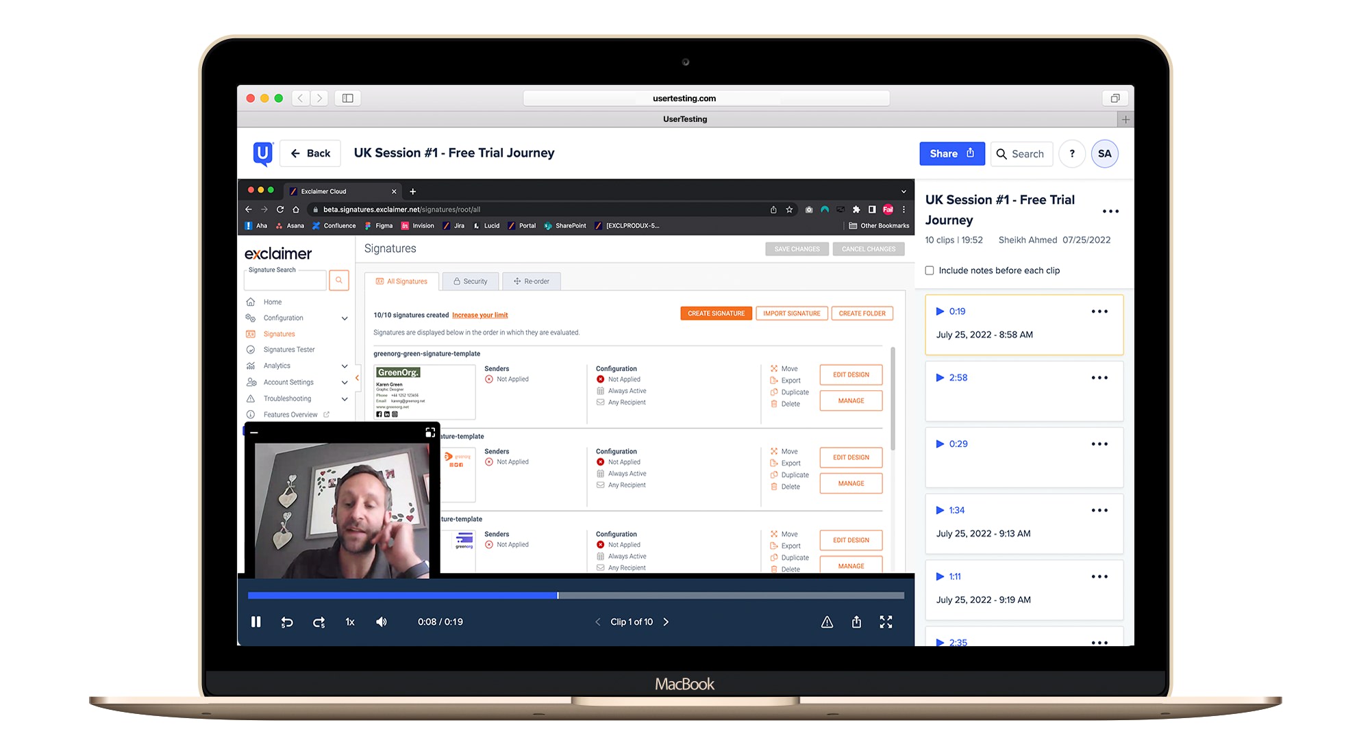
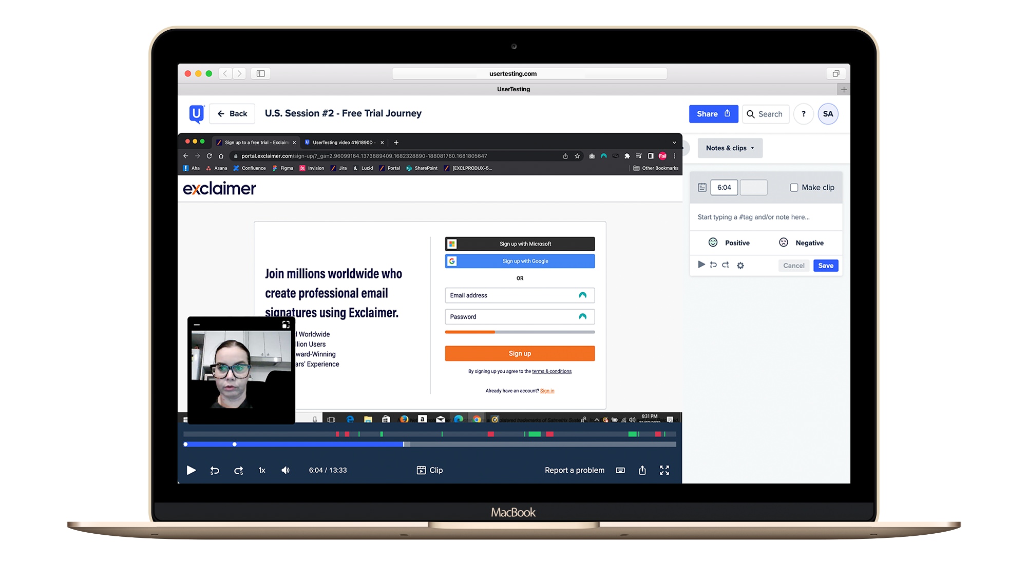
Then it was time to talk to customers! So via the UserTesting platform we spoke to some who had recently signed up to get their insight. We created a very simple slideshow presentation which posed some questions. Answers were captured via video interviews.
This proved a fascinating source of information, as we could clearly see where the pain points were. The main finding that came from the research was that this journey was clearly designed for the IT professional and not for anyone else!
Competitor Analysis
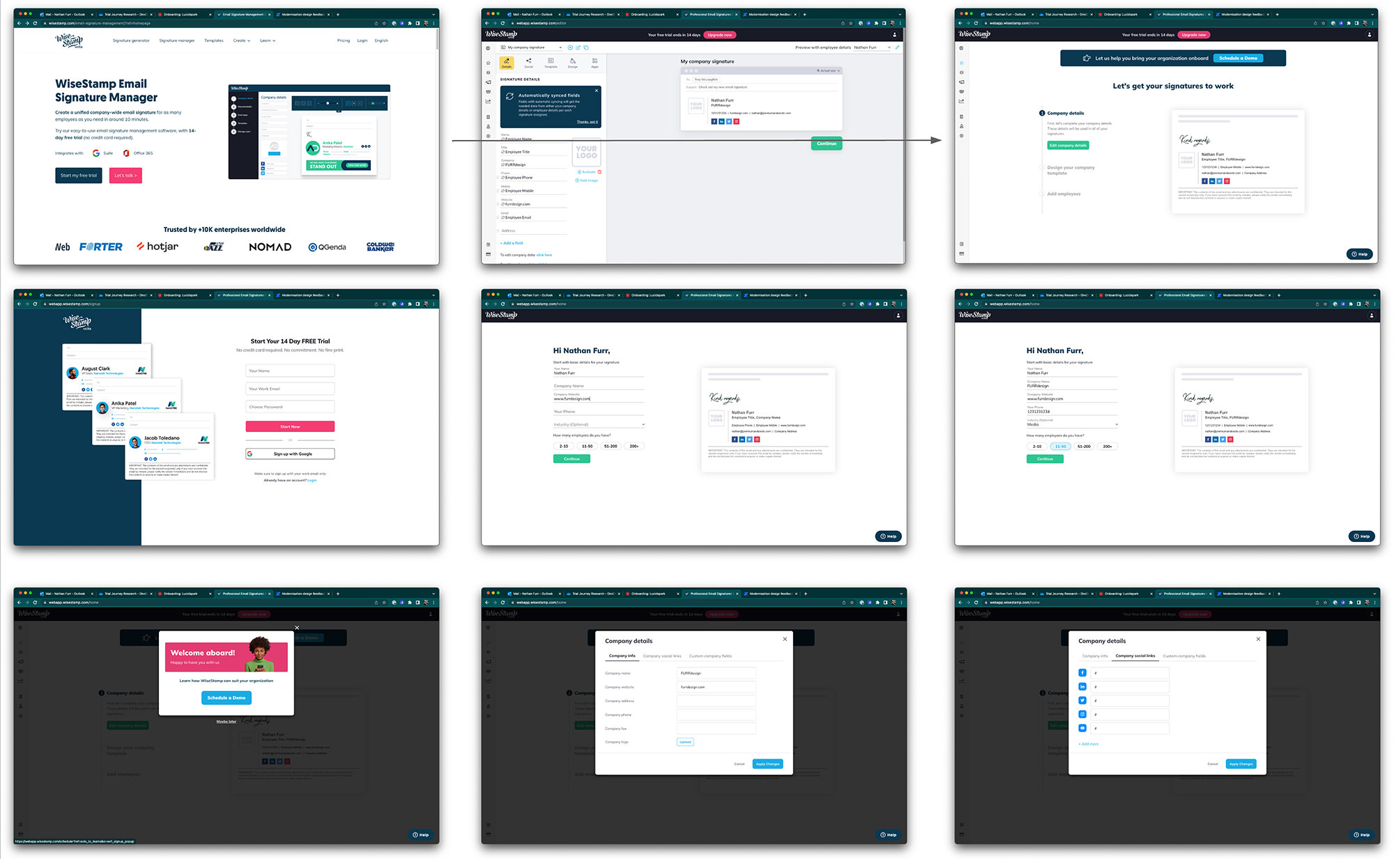
We then undertook some competitor analysis, both direct and indirect. Looking at other organisations that provided email signature management as well as browser based design services. And quickly understood a familiar design pattern emerging: show them the product upfront. So in essence we ‘flip the script’ and remove any UX friction in order to get the product into the hands of users as quickly as possible.
User Flows
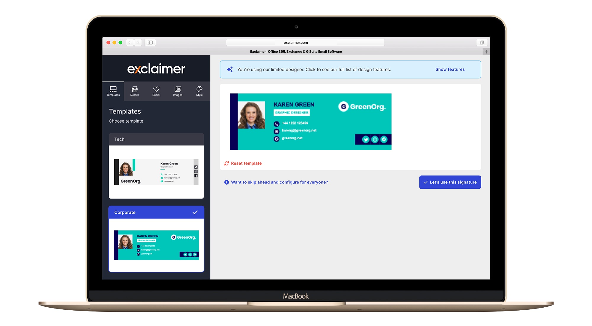
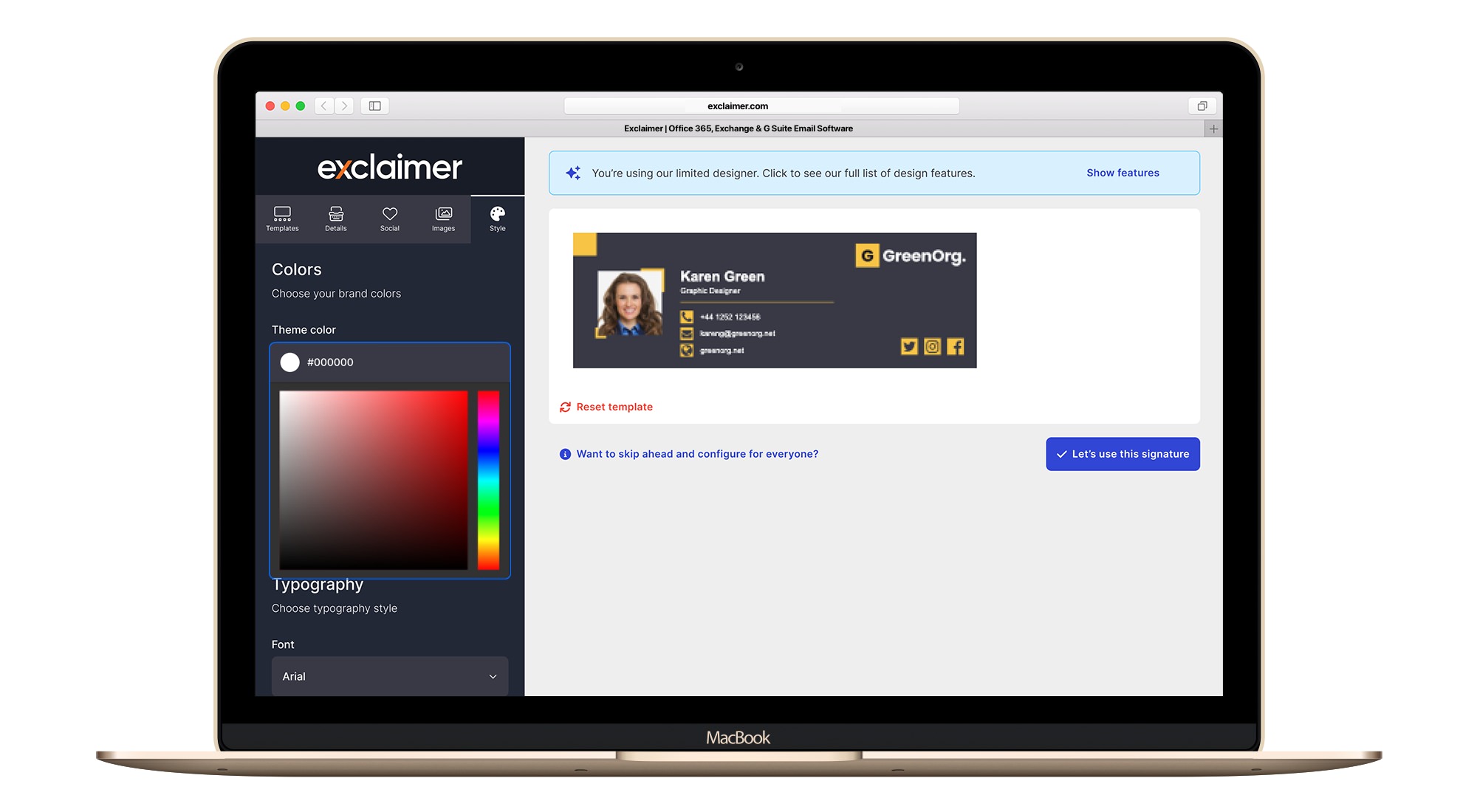
Once we were confident we knew which route to take, we then crafted a simple single user journey that would address all the issues we had learned. Simply put, as soon as the user clicks on ‘Free Trial’ they are taken to a brand new interface that will very quickly allow them to design an email signature.
We provide them with simple but powerful design tools to alter the design and explore ideas. When they are ready to share their email signature with others or they wish to progress to the next stage, we will then initiate the signup process. We went through several light iterations before settling on the final flow.
↑ Proposed new free trial journey shown as a user flow diagram.
Wireframes
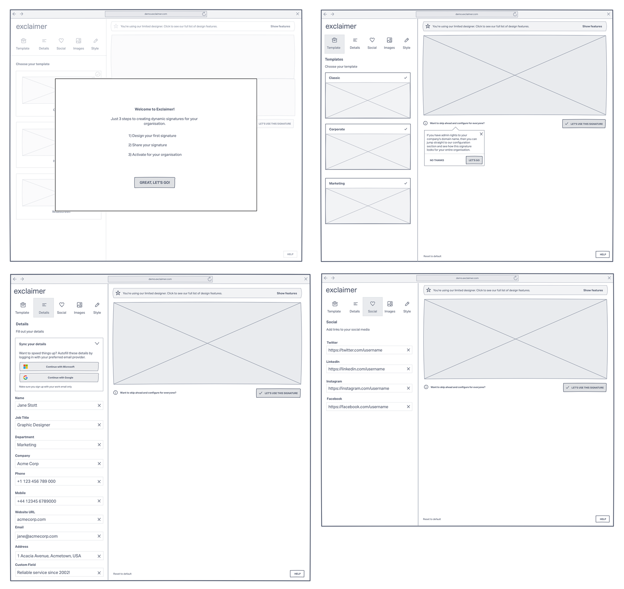
Moving onto the wireframe stage, we could now start to visualise how this new interface would look like. The ideas for this came from our own expertise in email signature design but also aligning it with expected behaviour in browser based design tools. Taking the best practice that we’d seen elsewhere and merging the two disciplines together.
As we continued to develop the wireframes we discovered some things we needed to alter in the user flow.
UI / Prototyping
Finally, using our design system, we were able to very rapidly build out a UI based prototype which included interactions. Again, through discovery and exploration we continually iterated the user flows and wireframes to ensure we were aligned in our thinking, approach and delivery.
↑ Proposed new free trial journey shown as interactive prototype. Click on play to view.
Conclusion
Once developed, we beta-tested this with a segmented audience for a limited time-period. We found that almost immediately the abandonment-rate dropped from 80% to 35%. This resulted in a higher rate of completed trials with more customers converting into a paid customer. We then staggered the roll out to everyone.
You can also view this project in Figma.
